This is a crucial distinction that is frequently confused. Basically, specification limits have to do with the voice of the customer while control limits have to do with the voice of the process.
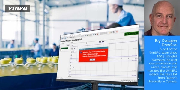
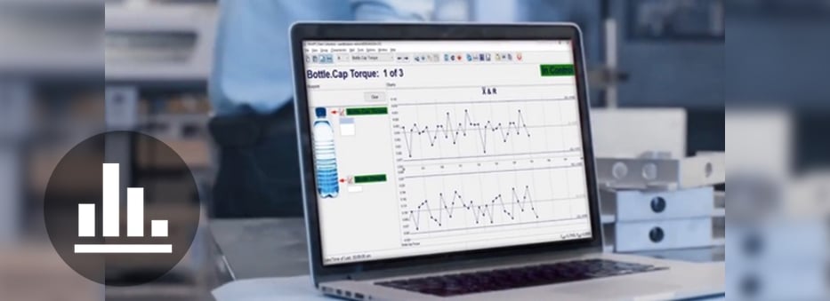
WinSPC can be set up to alert operators of production issues before defective product is turned out.
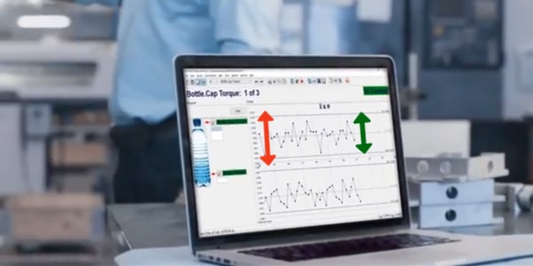
This is a crucial distinction that is frequently confused. Basically, specification limits have to do with the voice of the customer while control limits have to do with the voice of the process.
SPC Tools
SPC tools help to identify the source of process problems, define a process’s capability to meet a customer requirement, and assist with other insights. The graphic below is a quick-and-dirty explanation of six key SPC tools.
The Tools
Cause-and-Effect Diagrams
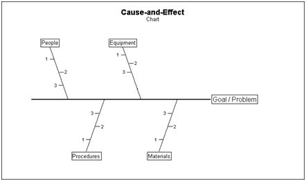
One analysis tool is the Cause-and-Effect (or Fishbone) diagram. These are also called Ishikawa diagrams because Kaoru Ishikawa developed them in 1943. They are called fishbone diagrams since they resemble one with the long spine and various connecting branches.
The fishbone chart organizes and displays the relationships between different causes for the effect that is being examined. This chart helps organize the brainstorming process. The major categories of causes are put on major branches connecting to the backbone, and various sub-causes are attached to the branches. A tree-like structure results, showing the many facets of the problem.
The method for using this chart is to put the problem to be solved at the head, then fill in the major branches. People, procedures, equipment and materials are commonly identified causes.
This is another tool that can be used in focused brainstorming sessions to determine possible reasons for the target problem. The brainstorming team should be diverse and have experience in the problem area. A lot of good information can be discovered and displayed using this tool.
Control Charts & Other Charts
Whether making mom’s recipe for spaghetti sauce or admitting patients to an emergency room, the outcome of a process is never exactly the same every time. Fluctuation or variability is an inevitable component of all systems and is expected, arising naturally from the effects of miscellaneous chance events. However, variation outside a stable pattern may be an indication that the process is not acting in a consistent manner. Events which fall beyond expected variability or events forming a pattern that is not random, indicate that the process is out of control.
From a quality control perspective, an out-of-control service or production system is trouble. It is probably not meeting customer specifications or achieving business goals, and there is no way of predicting if it will or can.
There are two general ways of detecting that a process is out of control. The first test for an out-of-control process asks, “Is any point falling above or below the control limits on its control chart?”. This particular test is very easy to perform by viewing the control chart. The second form of rule violations is based upon patterns of points on the control chart and can be difficult to detect.
Some SPC software programs can quickly and accurately perform such tests on process data using the Western Electric Rules, which are defined in AT&T’s Statistical Quality Control Handbook, the definitive source for rule violation standards.
Statistical Process Control charts graphically represent the variability in a process over time. When used to monitor the process, control charts can uncover inconsistencies and unnatural fluctuations. Consequently, SPC charts are used in many industries to improve quality and reduce costs.
Control charts typically display the limits that statistical variability can explain as normal. If your process is performing within these limits, it is said to be in control; if not, it is out of control.
It is important to remember what you can conclude about a system that is in control: control does not necessarily mean that a product or service is meeting your needs, it only means that the process is behaving consistently.
Here are some fundamental concepts and key terms related to control charts and other charts.
Rules Testing
How do you judge when a process is out of control? By plotting a control chart of the output of a process, it is possible to spot special or unnatural causes of variability and indications that the process is drifting. Drifting is defined by the mean or range of the variation changing as the process is running. The most common indication of change is a point falling outside of the control limits, but other tests for process instability are also valuable.
Different rules are appropriate for variable data and attribute data. Consequently, choosing which rules to apply depends on the type of chart being produced.
Zones In Control Charts
Many of the standard rules examine points based on zones. The area between each control limit and the centerline is divided into thirds. The third closest to the centerline is referred to as Zone A, the next third is Zone B, and the third closest to the control limits is Zone C. Note that there are two of each of the Zones, one upper and one lower.
Zone A is also referred to as the “3-sigma zone”, Zone B is the “2-sigma zone”, and Zone C is the “1-sigma zone”. These sigma zone terms are appropriate only when 3-sigma is used for the control limits.
Sigma is the Greek letter for s and is used in this context to denote the spread of data.

Standard control limits are located 3 sigma away from the average or centerline of the chart. The centerline is also called the control line. These are called 3 sigma limits or 3 sigma zones. The distance from the centerline to the control limits can be divided into 3 equal parts of one sigma each.
Statistical theory tell us that in normal data dispersion, we can expect the following percentages of data to be included within the sigma:
- 1 sigma – 68.3%
- 2 sigma – 95.5%
- 3 sigma – 99.7%
Control Limits
Control limits are calculated statistically from your data. They are referred to as the Lower Control Limit (LCL) and the Upper Control Limit (UCL) on a control chart. These are set at 3-sigma by default since this is the most commonly used limit.
Control limits define the zone where the observed data for a stable and consistent process occurs virtually all of the time (99.7%). Any fluctuations within these limits come from common causes inherent to the system, such as choice of equipment, scheduled maintenance or the precision of the operation that results from the design. These normal fluctuations are attributed to statistical variability.
An outcome beyond the control limits results from a special cause. Special causes are events external to the ordinary operation of a production or service. Special causes indicate that there have been one or more fundamental changes to the process and the process is out of control. Special causes need to be investigated and eliminated before a control chart can be used as a quality-monitoring tool.
Subgroups
An important factor in preparing for SPC charting is determining if you will measure every product of the process, such as measuring every part, or if you will use subgroups. Subgroups are a sample of data from the total possible data. Subgroups are used when it is impractical or too expensive to collect data on every single product or service in the process. Decisions to use subgroups or not needs to be carefully thought out to ensure they accurately represent the data.
Subgroups need to be homogenous within themselves so that special causes can be recognized, so problem areas stand out from the normal variation in the subgroup. For example, if you are in charge of analyzing processes in a number of facilities, a separate group should represent each facility, since each facility has different processes for doing the same tasks. Each facility subgroup should probably be broken down even further, for example by work shifts.
Subgroups in Variable Control Charts
All data in a subgroup has something in common, such as a common time of collection, all data for a particular date, a single shift, or a time of day.
Subgroup data can have other factors in common, such as data associated with an operator, or data associated with a particular volume of liquid.
Subgroups in Attribute Control Charts
A subgroup is the group of units that were inspected to obtain the number of defects or the number of rejects. The number of defects is displayed using c charts and u charts. The number of rejects, also called defective items, is displayed using p charts and np charts.
Rejects – Nonconforming Items Data
Nonconforming items are rejects. A reject is tallied when an entire unit fails to meet acceptance standards, regardless of the number of defects in the unit. This includes defective products or unacceptable outcomes.
Defects – Nonconformities Data
Nonconformities are defects. A nonconformity is any characteristic, which should not be present but is, or a characteristic which needs to be present but is not. A defective item can have multiple nonconformities, for example, errors on insurance forms, incorrect medication, or service complaints.
Using Process Control Charts
OK, enough talk. Let’s do some actual control charting. First you need to determine what data you have and select the correct chart for that data. Then make the chart and analyze it to see if the process is in control.
Data Definitions For Proper Chart Selection
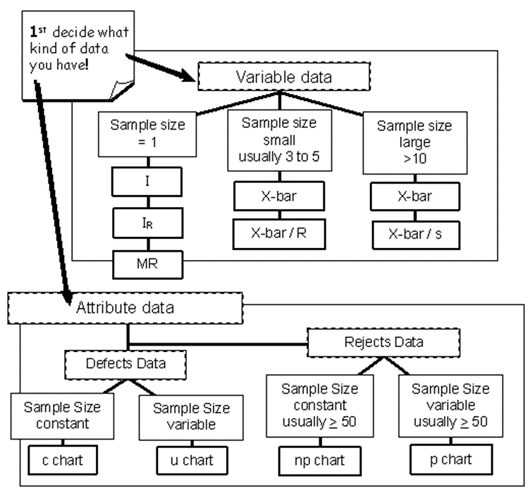
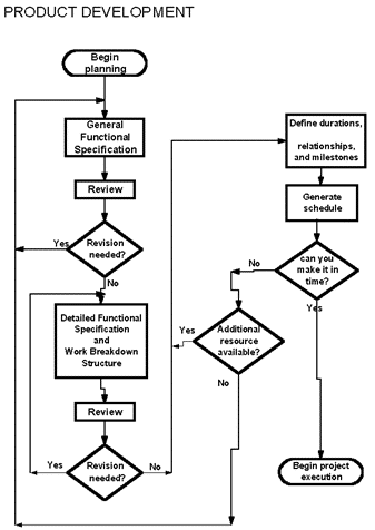
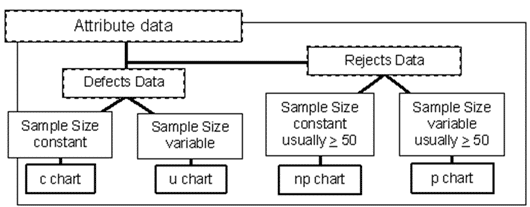
Choosing the correct chart for a given a situation is the first step in every analysis. There are actually just a few charts to choose from, and determining the appropriate one requires following some fairly simple rules based on the underlying data. These rules are described in the flowchart below:
Control charts are divided into two groups:
Variable Charts
Variable charts are based on variable data that can be measured on a continuous scale. For example, weight, volume, temperature, or length of stay. These can be measured to as many decimal places as necessary.
Individual, average, and range charts are used for variable data.
Attribute Charts
Attribute charts are based on data that can be grouped and counted as present or not. Attribute charts are also called count charts and attribute data is also known as discrete data. Attribute data is measured only with whole numbers. Examples include:
- Acceptable vs. non-acceptable
- Forms completed with errors vs. without errors
- Number of prescriptions with errors vs. without
Defect and reject charts are used for attribute data.
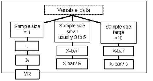
Variable Data Charts – Individual, Average, and Range Charts
Variable data requires the use of variable charts. Variable charts are easy to understand and use.
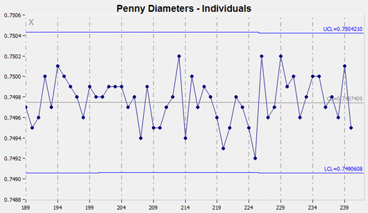
Individual Charts – I chart
The I chart is also referred to as an individual, item, i, or X chart. The X refers to a variable X.
Individual charts plot the process results varying over time. Individual observations are plotted on the I chart, averages are not plotted on this type of chart. Individual charts are used to plot variable data collected chronologically from a process, such as a part’s measurement over time.
These charts are especially useful for identifying shifts in the process average. When monitoring a system, it is expected that equal numbers of points will fall above and below the average that is represented by the centerline. Shifts or trends can indicate a change that needs to be investigated.
The individual control chart is reserved for situations in which only one measurement is performed each time the data is collected, where it is impractical or impossible to collect a sample of observations. When there are not enough data points to calculate valid control limits, an individual chart functions as a simple run chart.
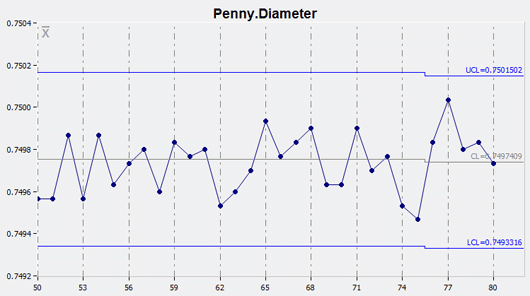
Average Charts – X-bar Chart
Average charts are made by plotting averages of individual measurements on the chart. The average chart is called the X-bar chart because, in statistical notation, a bar or line over the variable (X) symbolizes the average of X.
“X-bar” is a shorthand way of saying “the average of X”.
An X-bar chart is a variable control chart that displays the changes in the average output of a process. The chart reflects either changes over time or changes associated with a categorical data variable. The chart shows how consistent and predictable a process is at achieving the mean.
X-bar charts measure variation between subgroups. They are often paired with either Standard Deviation (S) or Range (R) charts, which measure variation within subgroups.
Definition: Variable Data Subgroups
Subgroup data has something in common, such as data associated with a particular operator, or data associated with a particular volume of liquid.
Range Chart – R-Chart
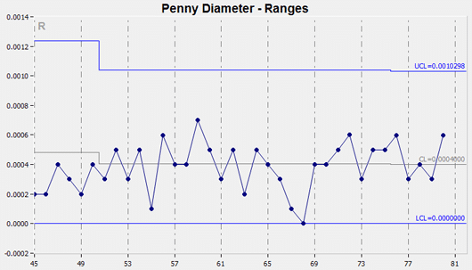
The Range chart can be combined with I charts and X-bar charts. The chart names combine the corresponding chart initials.
Range charts measure the variation in the data. An example is the weather report in the newspaper that gives the high and low temperatures each day. The difference between the high and the low is the range for that day.
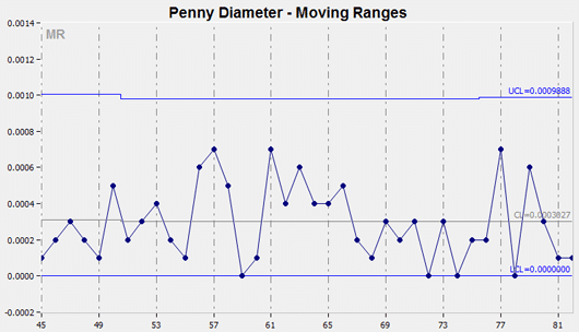
Moving Range Chart – MR Chart
This type of chart displays the moving range of successive observations. A moving range chart can be used when it is impossible or impractical to collect more than a single data point for each subgroup.
This chart can be paired with an individual chart, which is then called an Individual Moving Range (IR) chart. An individual chart is used to highlight the changes in a variable from a central value, the mean. The moving range chart displays variability among measurements based on the difference between one data point and the next.
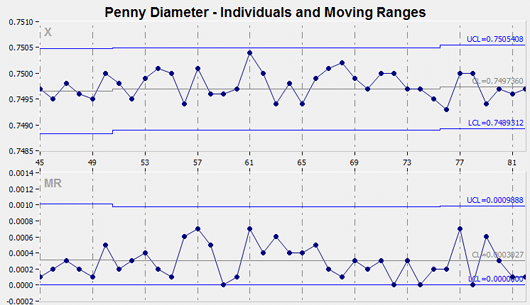
Individual And Range Charts – IR Charts
This pair of variable control charts is often offered together for quality control analysis. The Individual chart, the upper chart in the figure below, displays changes to the process output over time in relation to the center line which represents the mean. The Moving Range chart, the lower chart in the figure below, analyzes the variation between consecutive observations, which is a measure of process variability.
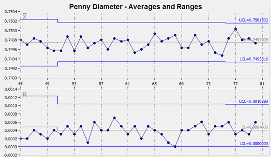
Average & Range Charts – X-Bar And R Charts
Variable and Range control charts are often displayed together for quality control analysis. The X-bar chart, the upper chart in the figure below, is a graphic representation of the variation among the subgroup averages, the R chart, the lower chart in the figure below, looks at variability within these subgroups.
The variation within subgroups is represented by the range (R). The range of values for each subgroup is plotted on the Y-axis of the R chart. The centerline is the average or mean of the range.
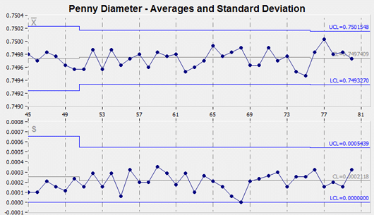
X-Bar Standard Deviation Charts – X-Bar And S Charts
This pair of variable control charts is often displayed together for quality control analysis. The X-bar chart, the upper chart in the figure below, displays the variation in the means between the subgroups. The s chart, the lower chart in the figure below, looks at variability within these subgroups.
In this pair of charts, the variation within subgroups is represented by the standard deviation. The standard deviation is plotted on the y-axis, and is a measure of the spread of values for each subgroup. The centerline is the average or mean of these sub-group standard deviations.
You can choose to use a standard deviation chart, i.e. an s-chart, instead of the Moving Range chart. The Range chart is often used because the standard deviation is a more accurate and therefore more difficult measurement. Now that computers are automatically calculating the standard deviation, the s-chart can be used in all situations. This is called the X-bar S chart.
A standard deviation formula is used to calculate the differences in the data. This calculation can be used in cases where the subgroup sample size is large and sampling methods support the modeling of the data as normal distribution.
Process Capability Chart – cp Chart
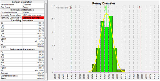
Process capability analysis is used to adjust the process until virtually all of the product output meets the specifications. Once the process is operating in control, capability analysis attempts to answer the question: Is the output meeting specifications, or is the process capable? If it is not, can the process be adjusted to make it capable?
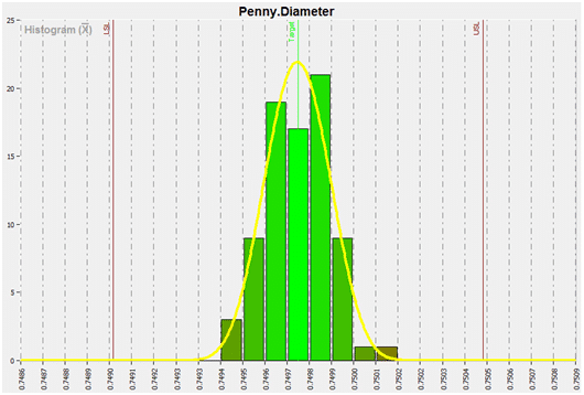
The process capability chart contains a normal curve superimposed over a histogram of the data, followed by several statistics. A process is said to be capable if its output falls within the specifications virtually 100% of the time.
Note: Specification Limits are the boundaries, or tolerances, set by management, engineers or customers which are based on product requirements or service objectives. Specification Limits are NOT established by the process itself, and may not even be possible within the given process.
One goal of Statistical Process Control is to determine if specifications are in fact possible in the current process. If the following statements are true, a process capability chart can be an appropriate tool for measuring the inherent reproducibility of the process and monitoring the degree to which it can meet specifications:
- The process is stable and in control.
- The data are normally distributed.
- Specification limits fall on either side of the centerline.
- You are investigating whether your process is capable of meeting specifications.
Attribute Data Charts
- Acceptable vs. non-acceptable
- Forms completed with errors vs. without errors
- Number of prescriptions with errors vs. without
- Defects data is the number of nonconformities within an item. There is no limit to the number of possible defects. Defects charts count the number of defects in the inspection unit.
- Rejects data where the entire item is judged to conform to product specifications or not. Rejects charts count the number of rejects in a subgroup.
For example:
If you are counting the number of errors made on an insurance form, you have an example of the defects per form. There is no limit to the number of defects that can be counted on each form.
If you are counting the total number of forms that had one or more errors, then you have a count of the rejected units. This is either one or zero rejects per unit.
Summary Of Defects vs. Rejects Data
In summary:
- Defects charts are attribute charts for cases in which the possible occurrences are infinite or cannot be counted. They count the number of non-conformities within an item.
- Rejects charts are attribute Data charts for the cases in which rejected whole units are counted. These figures can be described as ratios instead of just counts.
Subgroup Size – Constant or Changing?
Subgroup size is another important data characteristic to consider in selecting the right type of chart. When constructing attribute control charts, a subgroup is the group of units that were inspected to obtain the number of defects or the number of rejects.To choose the correct chart, you need to determine if the subgroup size is constant or not. If constant, for example 300 forms are processed every day, then you can look at a straight count of the defective occurrences. If the subgroup size changes, you need to look at the percentage or fraction of defective occurrences.
For example:
An organization may have a day in which 500 insurance forms are processed and 50 have errors vs. another day in which only 150 are processed and 20 have errors. If we only look at the count of errors, 50 vs. 20, we would assume the 50 error day was worse. But when considering the total size of the subgroup, 500 vs. 150, we determine that, on the first day, 10% had errors while, the other day, 13.3% had errors.
Now that we understand the different types of attribute data, let’s move on to the specific charts for analyzing them. There are four different types of attribute charts. For each type of attribute data, defects, and rejects, there is a chart for subgroups of constant size and one for subgroups of varying size.
Remember:
Defects Charts count the number of defects within the inspection unit.
Rejects Charts count the number of rejected units in a subgroup.
Defects Charts
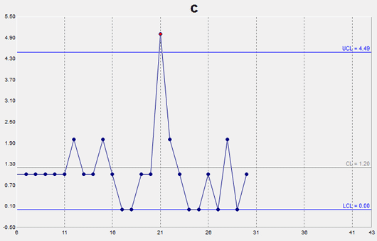
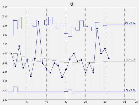
The two defects charts are the c chart and the u chart. The c refers to count of defects in a subgroup of constant size. The u is a per unit count within a variable size subgroup.
c Chart – Constant Subgroup Size
A c chart, or Count chart, is an attribute control chart that displays how the number of defects, or nonconformities, for a process or system is changing over time. The number of defects is collected for the area of opportunity in each subgroup. The area of opportunity can be either a group of units or just one individual unit on which defect counts are performed. The c chart is an indicator of the consistency and predictability of the level of defects in the process.
When constructing a c chart, it is important that the area of opportunity for a defect be constant from subgroup to subgroup since the chart shows the total number of defects. When the number of items tested within a subgroup changes, then a u chart should be used, since it shows the number of defects per unit rather than total defects.
u Chart – Varying Subgroup Size
A u chart (u is for Unit) is an attribute control chart that displays how the frequency of defects, or nonconformities, is changing over time for a process or system. The number of defects is collected for the area of opportunity in each subgroup. The area of opportunity can be either a group of items or just one individual item on which defect counts are performed. The u chart is an indicator of the consistency and predictability of the level of defects in the process.
A u chart is appropriate when the area of opportunity for a defect varies from subgroup to subgroup. This can be seen in the shifting UCL and LCL lines that depend on the size of the subgroup. This chart shows the number of defects per unit. When the number of items tested remains the same among all the subgroups, then a c chart should be used since a c chart analyzes total defects rather than the number of defects per unit.
Rejects Charts
The two types of Rejects charts are the p chart and the np chart. The name of the p chart stands for the Percentage of rejects in a subgroup. The name of the np chart stands for the Number of rejects within a p-type chart. You can also remember it as “not percentage” or “not proportional”.
A mnemonic to remember that the p chart and its partner, the np chart, represent Rejects data is to think of P as a “pea” and a canning plant that is rejecting cans of peas if they are not 100% acceptable. As p and np are a team, you should be able to recall this with the same story.
np Chart – Number of Rejects Chart for Constant Subgroup Size
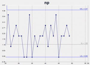 An np chart is an attribute control chart that displays changes in the number of defective products, rejects or unacceptable outcomes. It is an indicator of the consistency and predictability of the level of defects in the process.
The np chart is only valid as long as your data are collected in subgroups that are the same size. When you have a variable subgroup size, a p chart should be used.
p Chart – Percentage Chart for Varying Subgroup Size
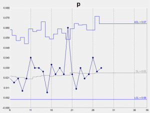 A p chart is an attribute control chart that displays changes in the proportion of defective products, rejects, or unacceptable outcomes. It is an indicator of the consistency and predictability of the level of defects in the process.
Since a p chart is used when the subgroup size varies, the chart plots the proportion or fraction of items rejected, rather than the number rejected. This is indicated by the shifting UCL and LCL lines that depend on the size of the subgroup. For each subgroup, the proportion rejected is calculated as the number of rejects divided by the number of items inspected. When you have a constant subgroup size, use an np chart instead.
Flow Charts
After a process has been identified for improvement and given high priority, it should then be broken down into specific steps and put on paper in a flowchart. This procedure alone can uncover some of the reasons a process is not working correctly. Other problems and hidden traps are often uncovered when working through this process.
Flowcharting also breaks the process down into its many sub-processes. Analyzing each of these separately minimizes the number of factors that contribute to variation in the process.
After creating the flowchart, you may want to take another look at the fishbone diagram and see if any other factors have been uncovered. If so, you may need to do another Pareto diagram as well. Quality Control is a continual process, in which factors and causes are constantly reviewed and changes made as required.
Histograms
Now you can put the data from the check sheets into a histogram. A histogram is a snapshot of the variation of a product or the results of a process. It often forms the bell-shaped curve which is characteristic of a normal process.
The histogram helps you analyze what is going on in the process and helps show the capability of a process, whether the data is falling inside the bell-shaped curve and within specifications.
A histogram displays a frequency distribution of the occurrence of the various measurements. The variable being measured is along the horizontal x-axis, and is grouped into several ranges of measurements. The frequency of occurrence of each measurement is charted along the vertical y-axis.
Histograms depict the central tendency or mean of the data, and its variation or spread. A histogram also shows the range of measurements, which defines the process capability. A histogram can show characteristics of the process being measured, such as:
- Do the results show a normal distribution, a bell curve? If not, why not?
- Does the range of the data indicate that the process is capable of producing what is required by the customer or the specifications?
- How much improvement is necessary to meet specifications? Is this level of improvement possible in the current process?
Pareto Charts
The Pareto chart can be used to display categories of problems graphically so they can be properly prioritized. The Pareto chart is named for a 19th century Italian economist who postulated that a small minority (20%) of the people owned a great proportion (80%) of the wealth in the land.
There are often many aspects of a process or system that can be improved, such as the number of defective products, time allocation, or cost savings. Each aspect usually contains many smaller problems, making it difficult to determine how to approach the issue. A Pareto chart or diagram indicates which problem to tackle first by showing the proportion of the total problem that each of the smaller problems comprise. This is based on the Pareto principle: 20% of the sources cause 80% of the problem.
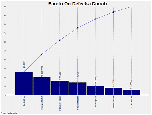
A Count Pareto chart is a vertical bar graph displaying rank in descending order of importance for the categories of problems, defects or opportunities. Generally, you gain more by working on the problem identified by the tallest bar than trying to deal with the smaller bars. However, you should ask yourself what item on the chart has the greatest impact on the goals of your business, because sometimes the most frequent problem as shown by the Pareto chart is not always the most important. SPC is a tool to be used by people with experience and common sense as their guide.
This is a Pareto chart of defect types for whipped cream cans.
Once a major problem has been selected, it needs to be analyzed for possible causes. Cause-and-effect diagrams, scatter plots and flow charts can be used in this part of the process.
Probability Plots
In order to use Control Charts, the data needs to approximate a normal distribution, to generally form the familiar bell-shaped curve.
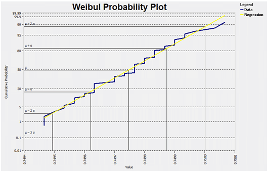
The probability plot is a graph of the cumulative relative frequencies of the data, plotted on a normal probability scale. If the data is normal it forms a line that is fairly straight. The purpose of this plot is to show whether the data approximates a normal distribution. This can be an important assumption in many statistical analyses.
Although a probability plot is useful in analyzing data for normality, it is particularly useful for determining how capable a process is when the data is not normally distributed. That is, we are interested in finding the limits within which most of the data fall.
Since the probability plot shows the percent of the data that falls below a given value, we can sketch the curve that best fits the data. We can then read the value that corresponds to 0.001 (0.1%) of the data. This is generally considered the lower natural limit. The value corresponding to 0.999 (99.9%) is generally considered the upper natural limit.
(Note: To be more consistent with the natural limits for a normal distribution, some people choose 0.00135 and 0.99865 for the natural limits.)
Scatter Diagrams
The Scatter diagram, or plot, is another problem analysis tool. Scatter plots are also called correlation charts.
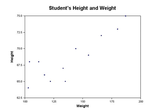
A Scatter plot is used to uncover possible cause-and-effect relationships. It is constructed by plotting two variables against one another on a pair of axes. A Scatter plot cannot prove that one variable causes another, but it does show how a pair of variables is related and the strength of that relationship. Statistical tests quantify the degree of correlation between the variables.
In this example, there appears to be a relationship between height and weight. As the student gets taller, generally speaking they get heavier.
